2019 - 2021
From Noise to Essential:
Designing the first-ever utility app for IIT Dhanbad students
Role
Product Designer II
Organisation
Mailer Daemon
Product
1 mobile app
Team
1 Designers, 4 Engineers
Overview
Mailer Daemon is the student-led journalism group at IIT Dhanbad.
They cover campus stories across formats: news reports, long-form articles, surveys, interviews, editorials, and visual content.
Think of it as a student newsroom meets campus pulse. Run by a tight-knit, creative collective.
The team follows a flat, open structure where everyone's ideas and suggestions are welcome, whether you're a member or part of the campus community.
With an active presence on Facebook, Instagram, and LinkedIn, Mailer Daemon connects students, faculty, and alumni through stories that matter to the IIT Dhanbad community.
Current Scenario
Mailer Daemon had reach, but the experience didn’t match.
While our Facebook and Instagram pages reached over 20,000 people, the Android app, intended as a direct, personal channel, was widely underused.
Students had complaints. The UI felt outdated. Navigation was broken. And most feedback boiled down to one truth: the app didn’t feel like it was built for them.
Also, there was no iOS app at all. That wasn’t a major blocker, but it was a missed opportunity. Especially for a journalism society trying to look modern and relevant on every platform.
We saw this gap not just as a chance to fix UX, but to rethink our role entirely.
Old app UI
For context, here is the homescreen of the old application:
The Opportunity
Originally, the Mailer Daemon app was designed to host only journalism content. But as we looked closer, we saw something bigger.
At IIT Dhanbad, there was no single utility app built for students. Not for timetables, contacts, attendance, or placement data.
So we reframed the challenge:
What if the journalism app became the student app?
What if it solved real daily problems and built more visibility for journalism in the process?
The iOS rewrite became a vehicle for a complete redesign.
One that could turn a content app into a daily-use utility product.
Three birds. One stone.
Goal
Redesign the Mailer Daemon mobile app.
Not just to look better, but to feel indispensable.
We wanted to solve real student problems, modernize the experience, and build something worth opening daily.
My Process
"Great design is about process.. not the product"
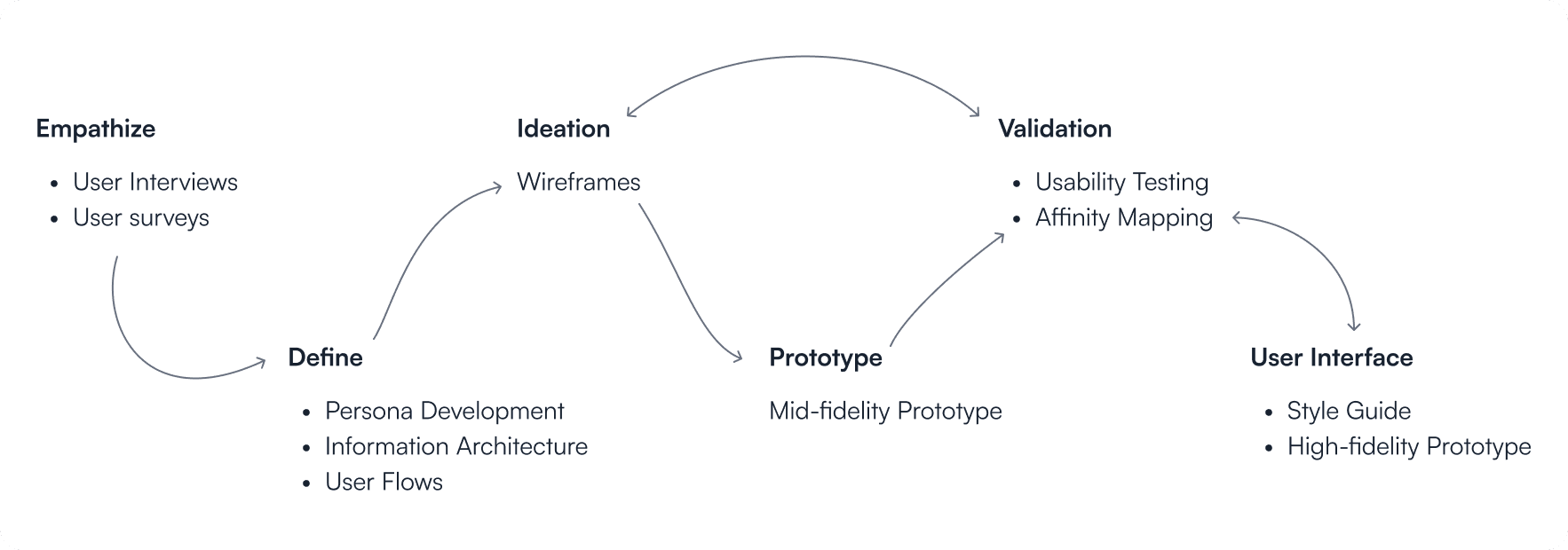
Empathize
To understand the problems faced by students using the old Mailer Daemon app, I conducted interviews with 62 users aged 17 to 23.
Many users stopped using the app over time.
The biggest reason was a confusing navigation system, which left them feeling lost. Eventually, most turned to our Facebook page for campus updates instead.
Only one feature really brought them back: the attendance manager. But even that needs a better experience.
Other suggestions included:
Make all "daemons" easier to find by organizing them clearly
Replace contacts and campus map on the homepage with more useful info
Add a proper search feature
Show notifications in one place
Include Student Senate member details
Auto-show timetable once the student selects their branch and year
Add placement stats
Improve the overall design to make it more engaging
Define
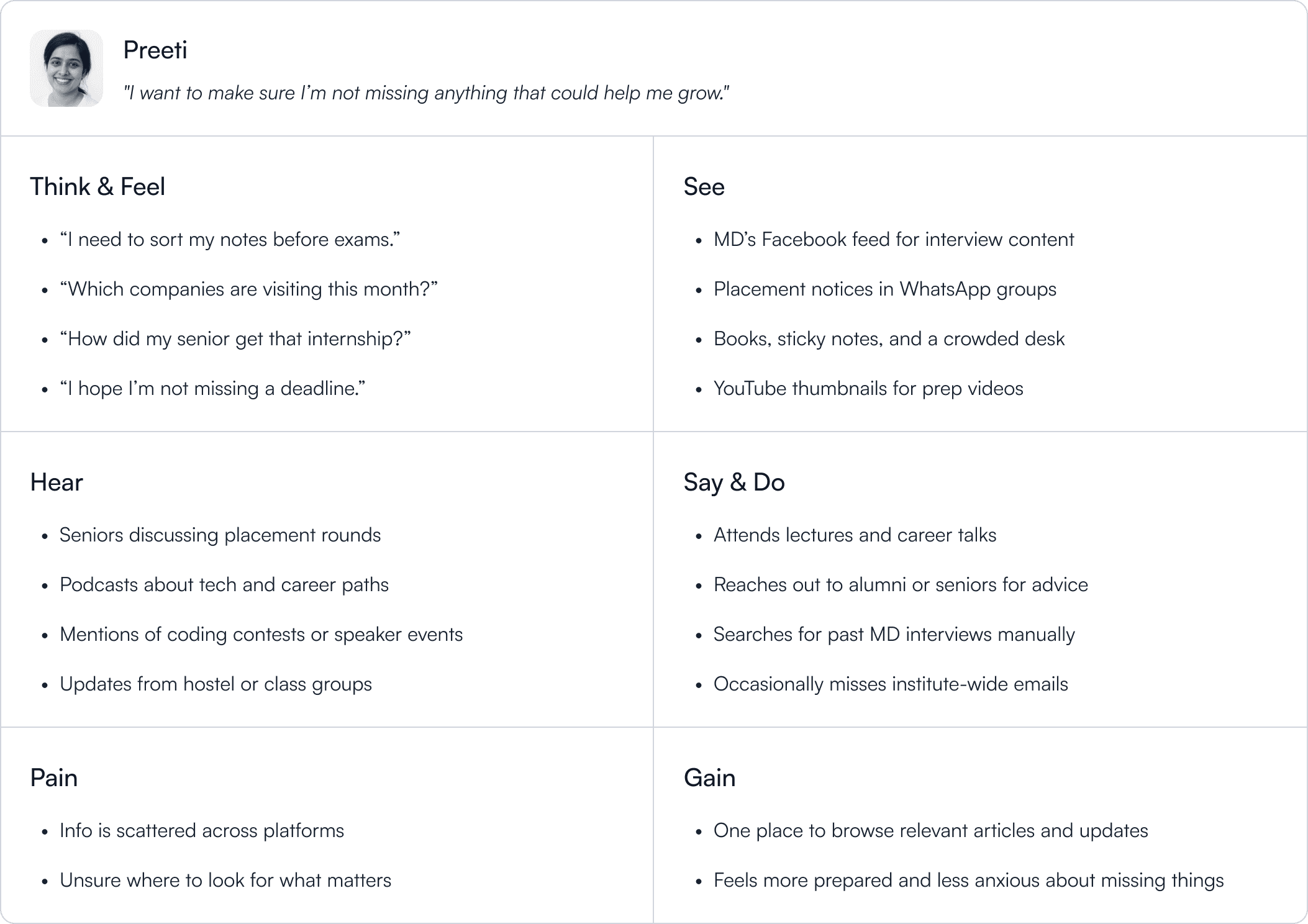
I created student personas based on interviews, behavioral patterns, and tool usage. These reflected real student workflows, not assumptions.
Target Users: Students of IIT Dhanbad (including B.Tech, M.Tech, PhD, and Research Scholars)
Age Range: 17 to 26 years
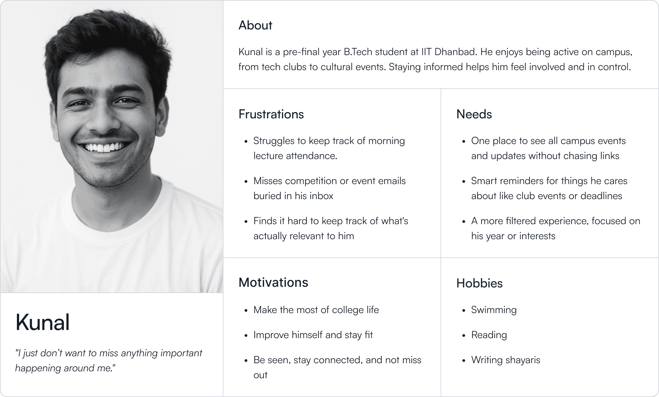
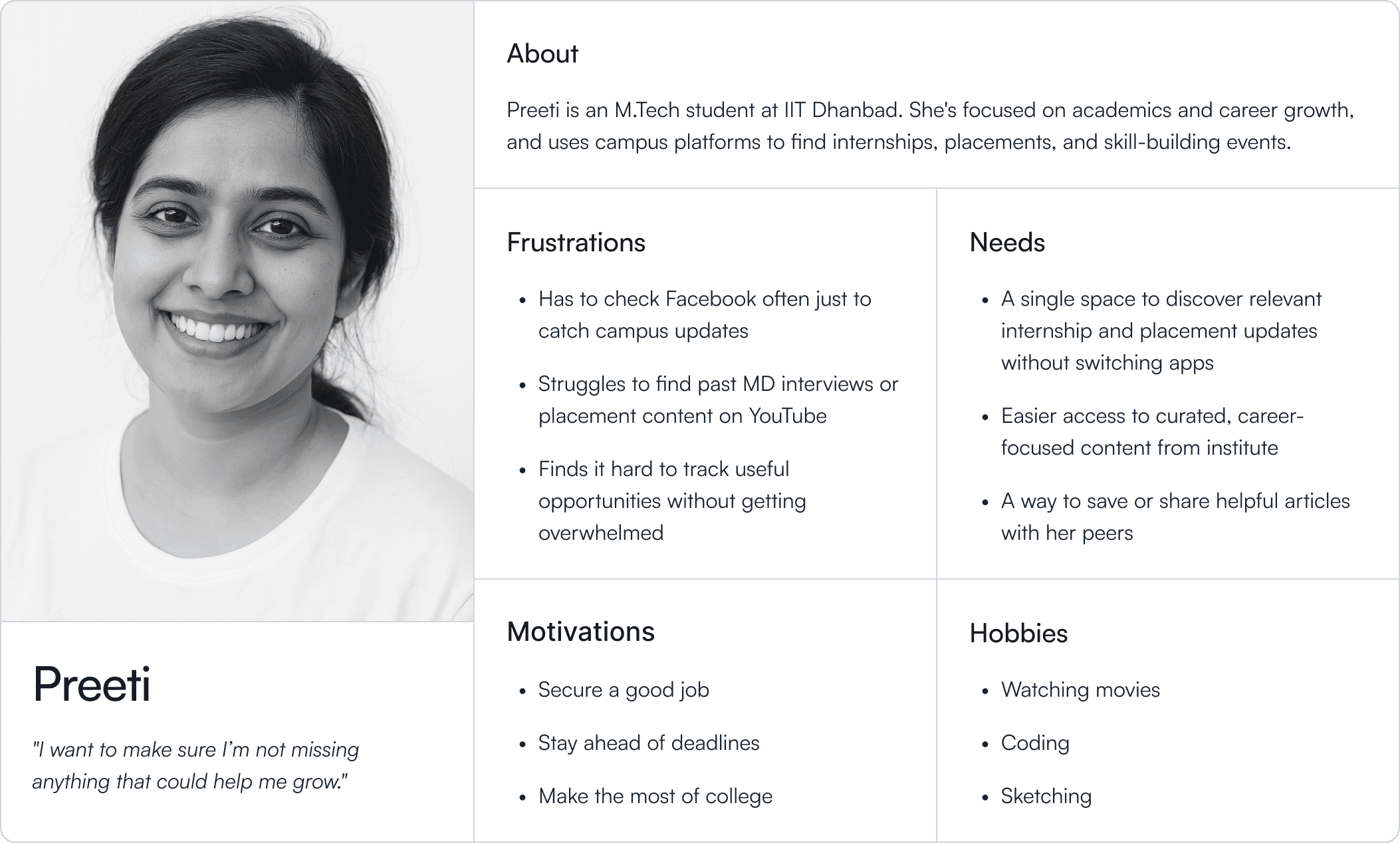
I mapped motivations, frustrations, and expectations to visualize the gap between what students wanted vs. what we were giving them.
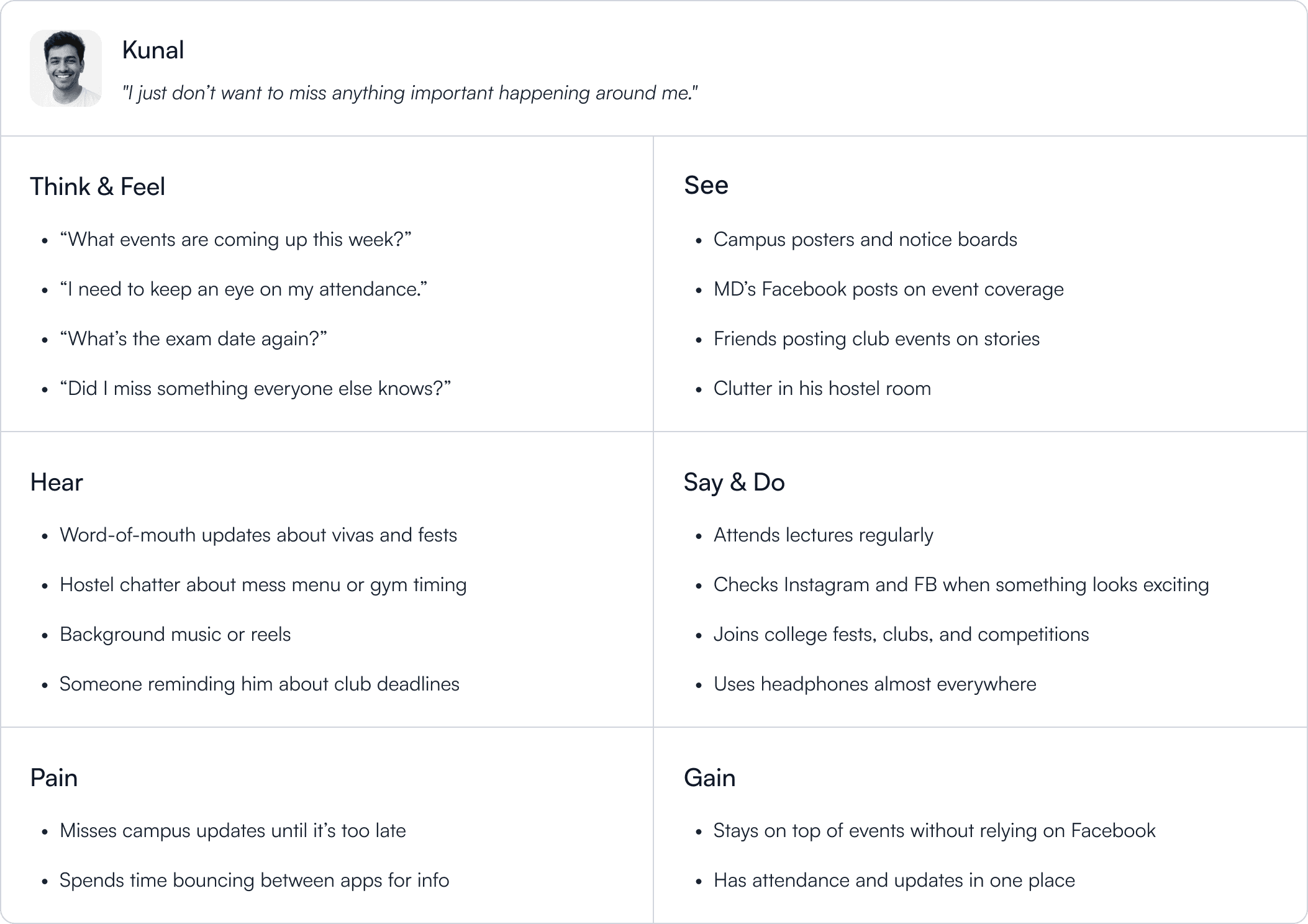
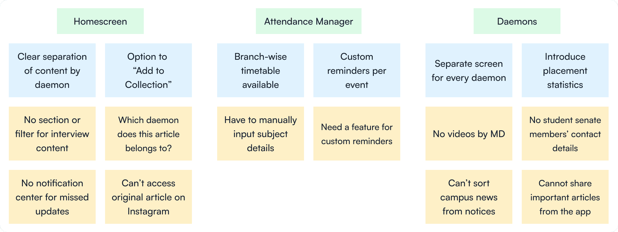
Once I had clarity on the target users and their pain points, I moved on to affinity mapping.
Raw feedback → grouped themes → design priorities.
Yellow notes for direct quotes. Blue notes for synthesis.
This gave us a bird’s-eye view of what mattered most, and how it tied to our journalism mission.
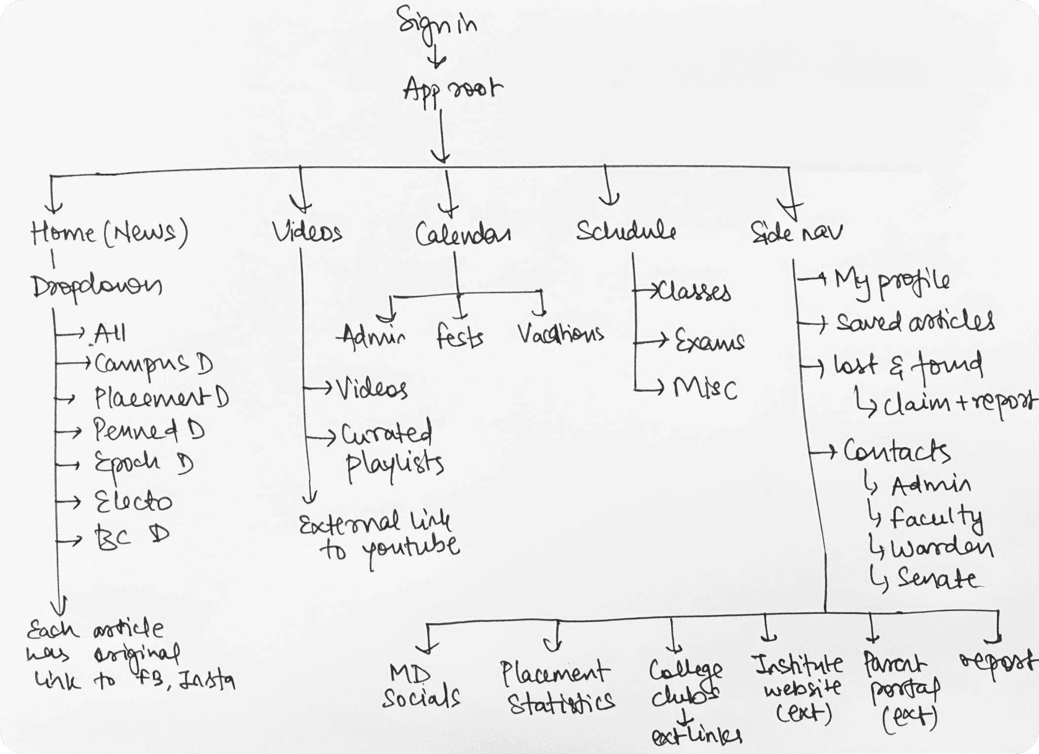
Before diving into wireframes, I mapped out a simple user flow to understand how the core features would come together and how users would move through the app.
This gave me a clear picture of how everything should be organized, making it easier to plan the layout and continue the design process with confidence.
Ideation
I ideated via rough sketches and low-fidelity wireframes.
Wireframes are quick, low-fidelity layouts that help test ideas early. They let me spot issues and make changes before going too deep into design.
It saves time and avoids the frustration of building something that doesn't land well with users.
I only move to visual design once the wireframes are tested and validated.
Validation
Even at low fidelity, students were able to point out real issues.
Misunderstood icons
Cluttered layouts
Missing cross-links between content and tools
Testing these wireframes surfaced ideas I hadn't considered earlier. Some gaps only became clear after seeing users interact with them.
This round of testing helped me make meaningful improvements before moving forward.
Design
I’ve always admired how Apple designs. Not just for beauty, but for clarity. Their apps are minimal, but never at the cost of experience.
This redesign was my way of studying that balance. I took cues from Apple’s design language and other minimal interfaces, not to copy, but to learn how simplicity can still feel powerful.
My north star? To make the app feel like something Apple could’ve designed. Ambitious? Sure. But it pushed me to obsess over the small things that make an interface feel calm, deliberate, and human.
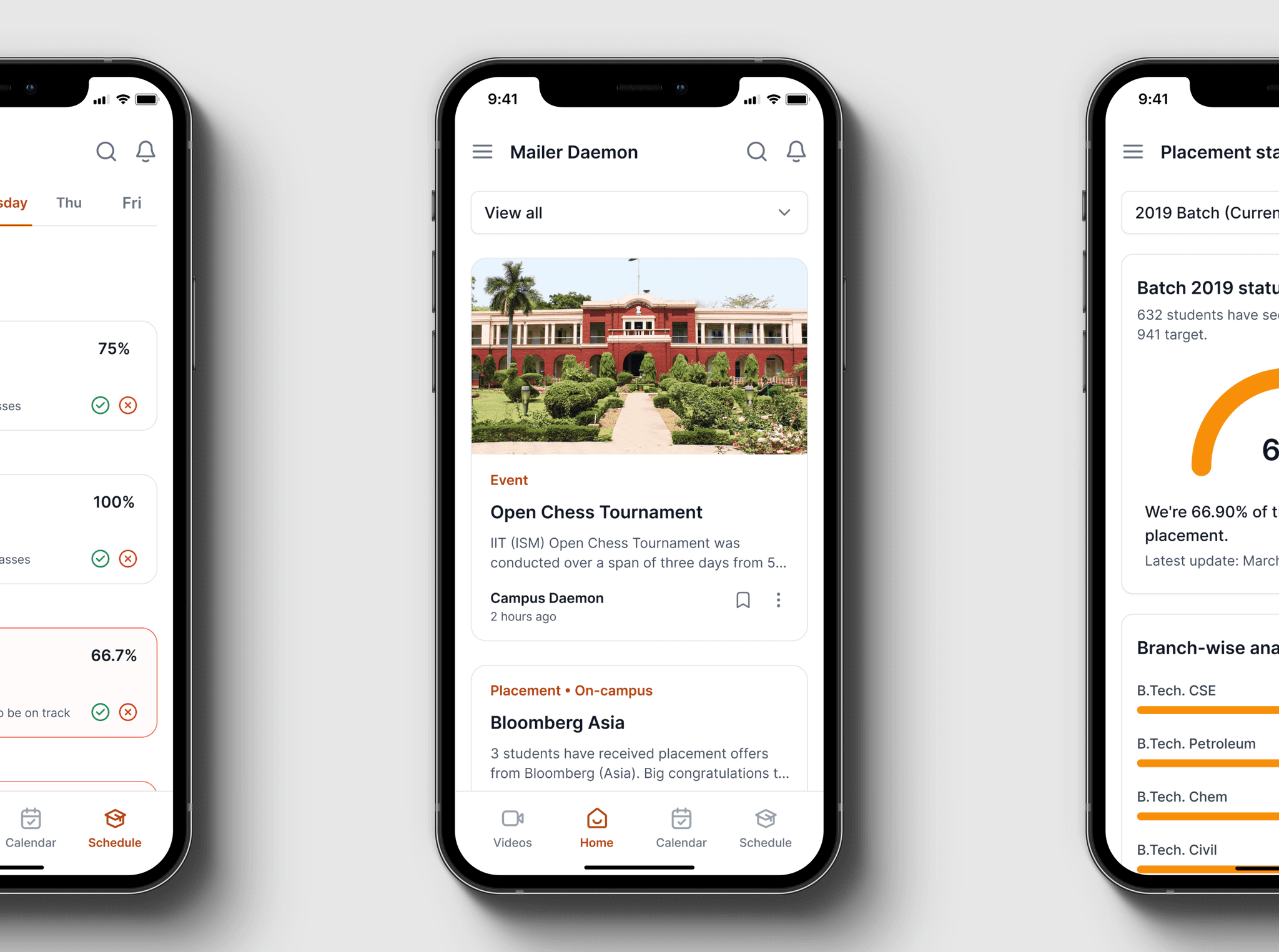
I rethought the home screen from the ground up and named it the News tab, because that’s exactly what it delivers.
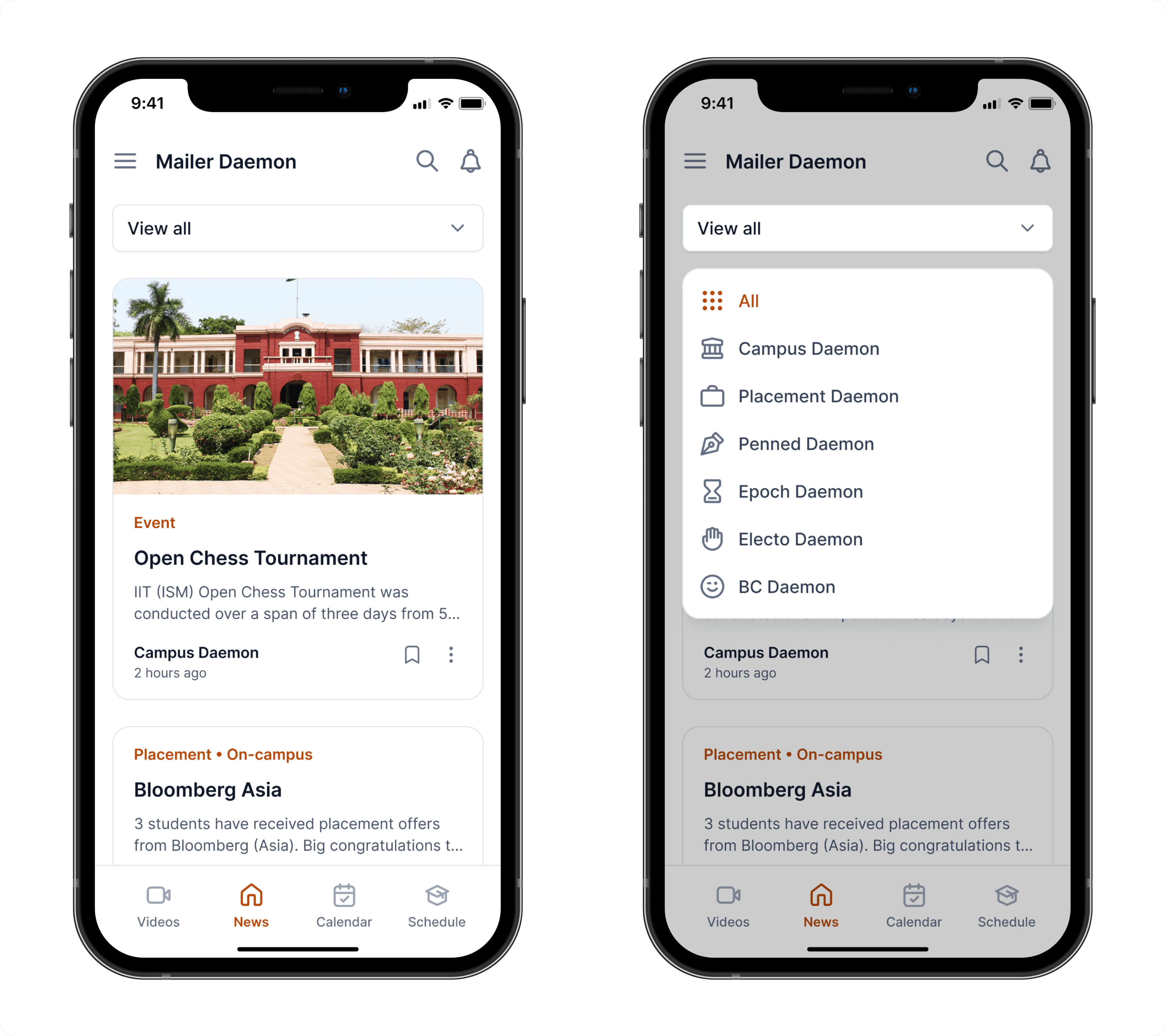
The new layout gives users more control and clarity. Now they can:
Save important or favorite articles for later
Search for specific pieces instead of scrolling endlessly
Switch between daemons with a single tap
Catch up on missed notifications in one place
Share article across other platforms
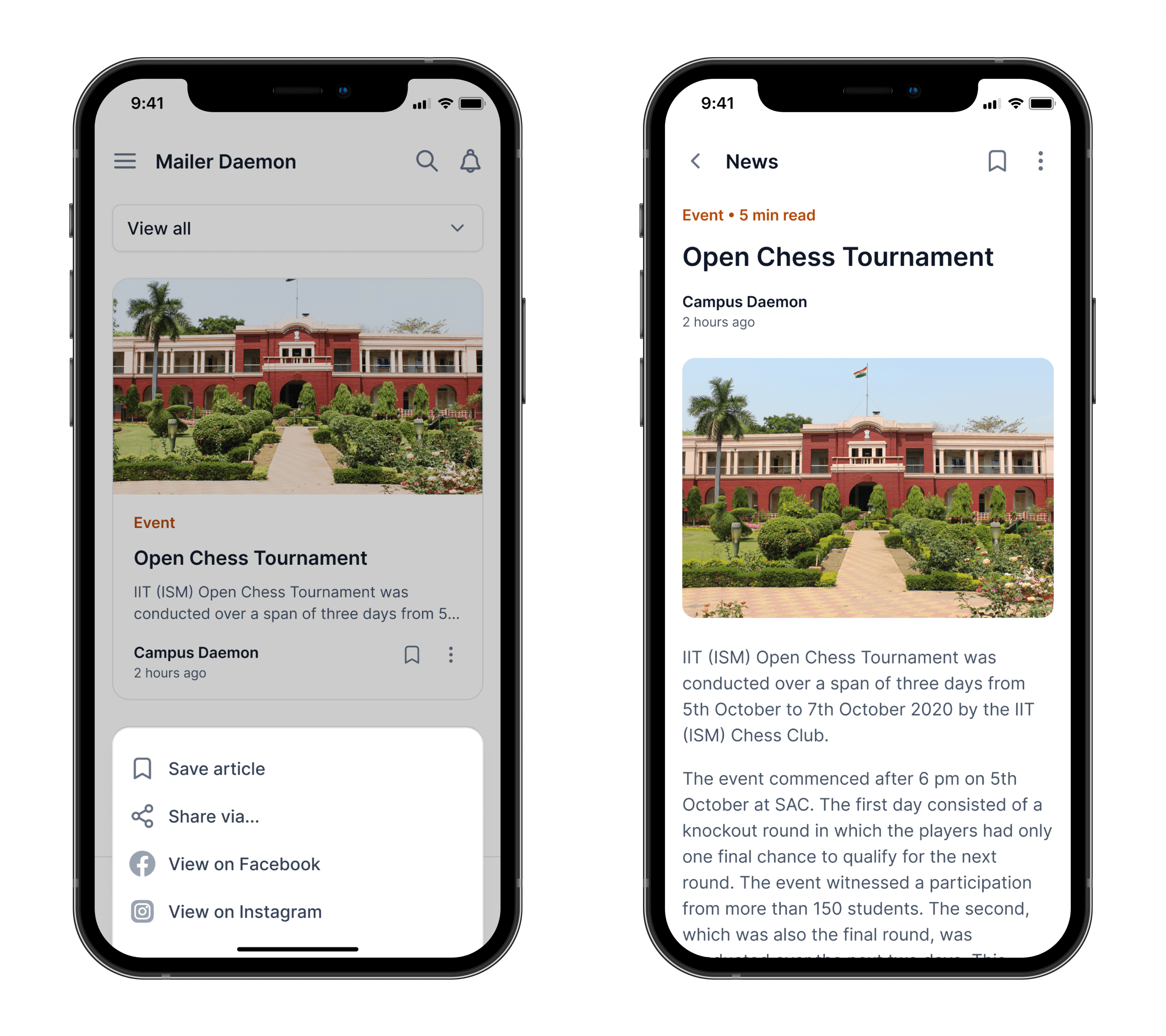
We also used this opportunity to drive more visibility to our original posts.
Every article now links back to its source post on social media, letting students view the full context and engage through comments, shares, and reactions.
It turned passive readers into active participants.
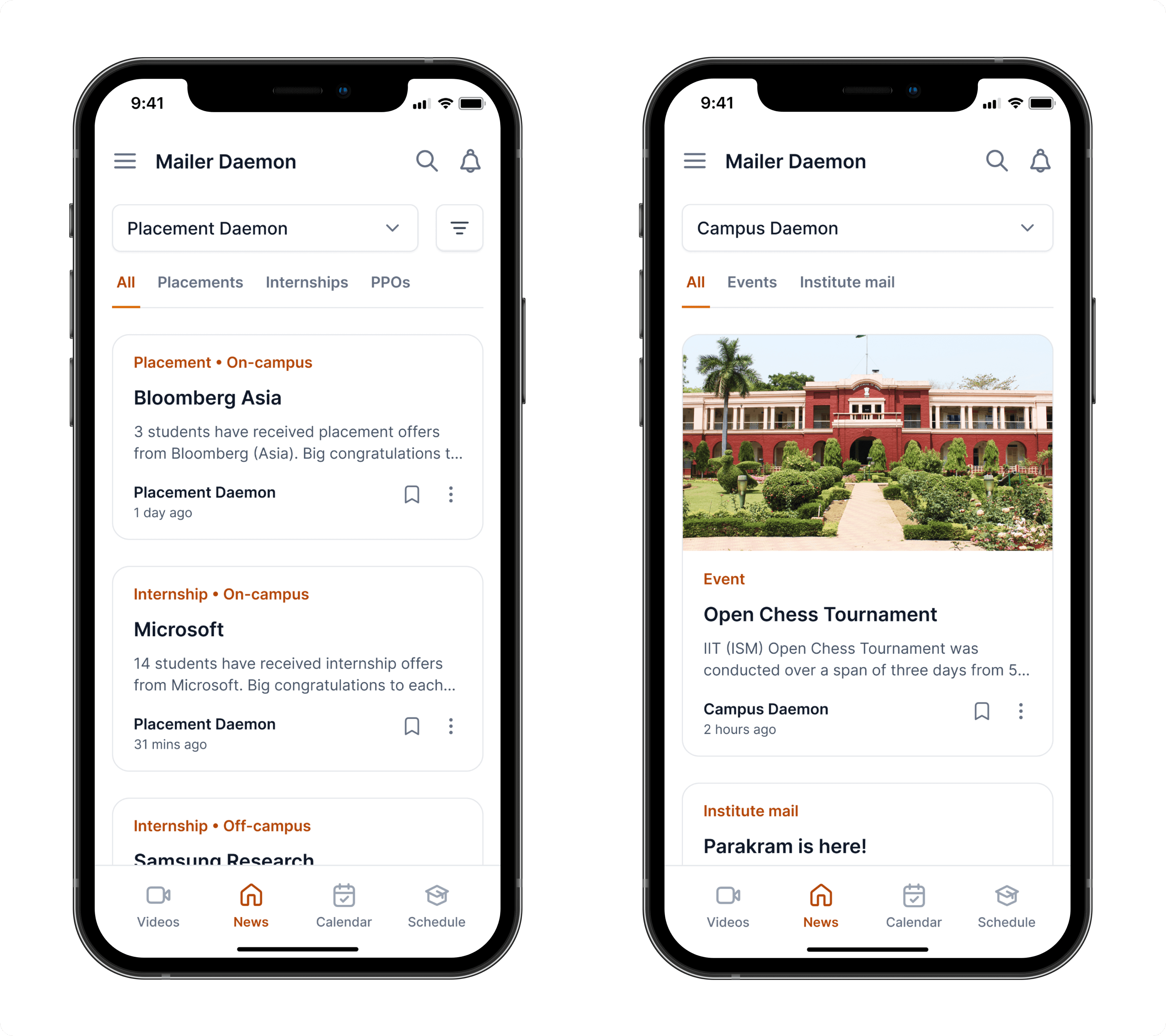
The dropdown wasn’t just a filter, it was a gateway into how Mailer Daemon structured its entire content experience.
MD organized its articles into seven major themes, called daemons. Each daemon represented a category of stories with its own tone, relevance, and audience pull.
For example:
Campus Daemon surfaced event recaps and institute-wide updates often buried in emails
Placement Daemon celebrated student wins across internships and full-time offers, both on-campus and off-campus
Each daemon came with its own nested structure… subcategories that dynamically expanded as users selected a primary daemon from the dropdown.
This system didn’t just sort content. It helped readers navigate across journalism, utility, and recognition, without ever feeling lost.
While most knew Mailer Daemon for written content, we also produced video journalism, especially interviews with students who landed top-tier placements and internships.
Alongside that, we covered campus fests, faculty talks, and event montages. But most of this content lived on YouTube, buried and disconnected from our app experience.
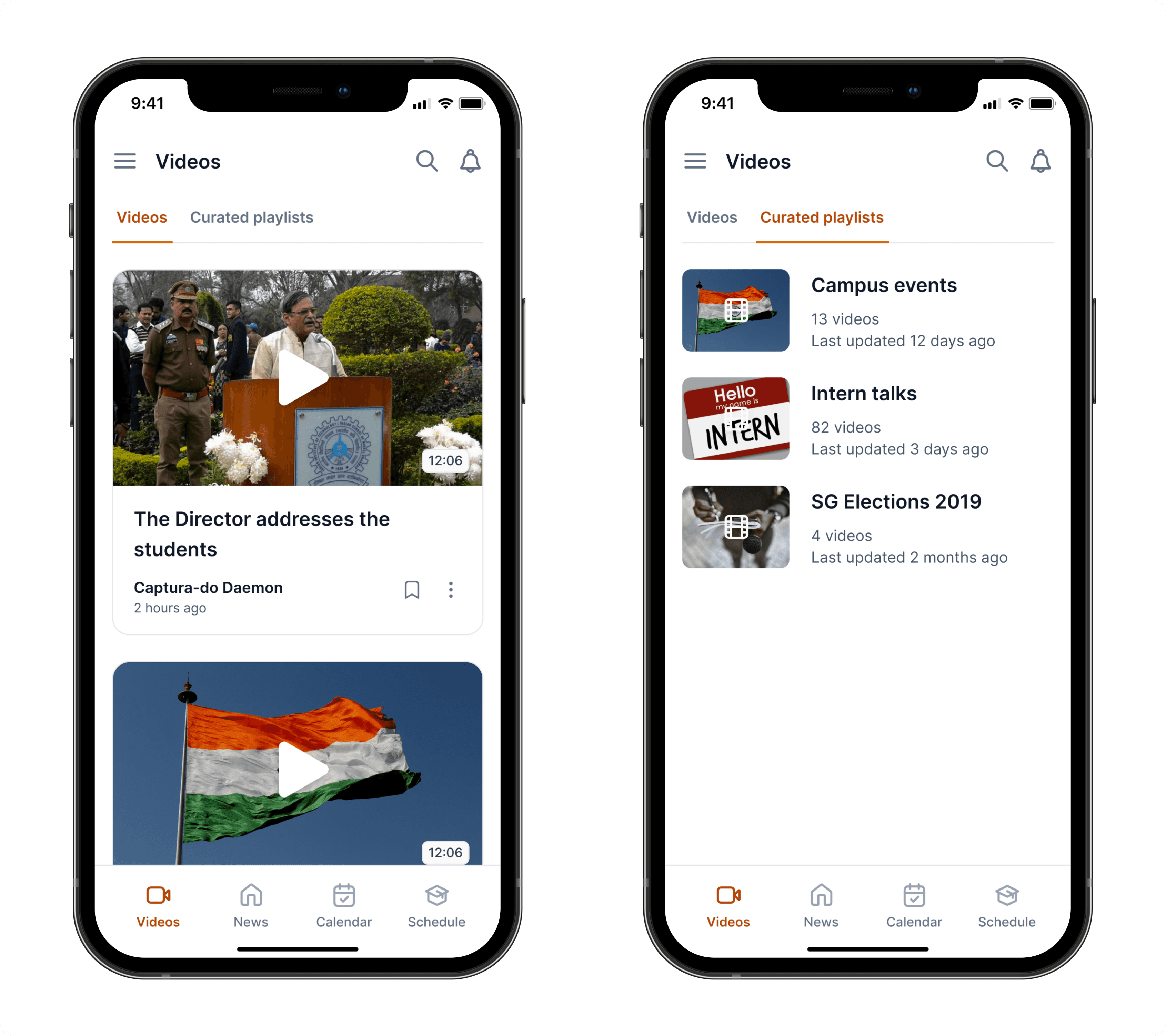
To close that gap, I introduced a dedicated Videos tab that surfaces our most relevant playlists and featured videos. Pulling directly from YouTube and organizing them contextually. It gave us a way to bring high-impact stories (like student interviews) into the app, while also driving more engagement to our channel.
This tab helped turn scattered video content into a discoverable, structured part of the journalism experience.
At IIT Dhanbad, every academic year starts the same way: a PDF calendar with all the key dates: exams, vacations, festivals, everything.
The problem? No one ever remembered where that PDF was.
Students kept reopening it just to answer basic questions like “When does midsem start?” or “Is Techfest before the Diwali break?”
I redesigned this flow around real usage, not a generic calendar UI, but a purpose-built academic timeline tailored to our institute’s structure.
We surfaced what mattered, removed what didn’t, and turned that PDF into an always-available, visual calendar students could trust.
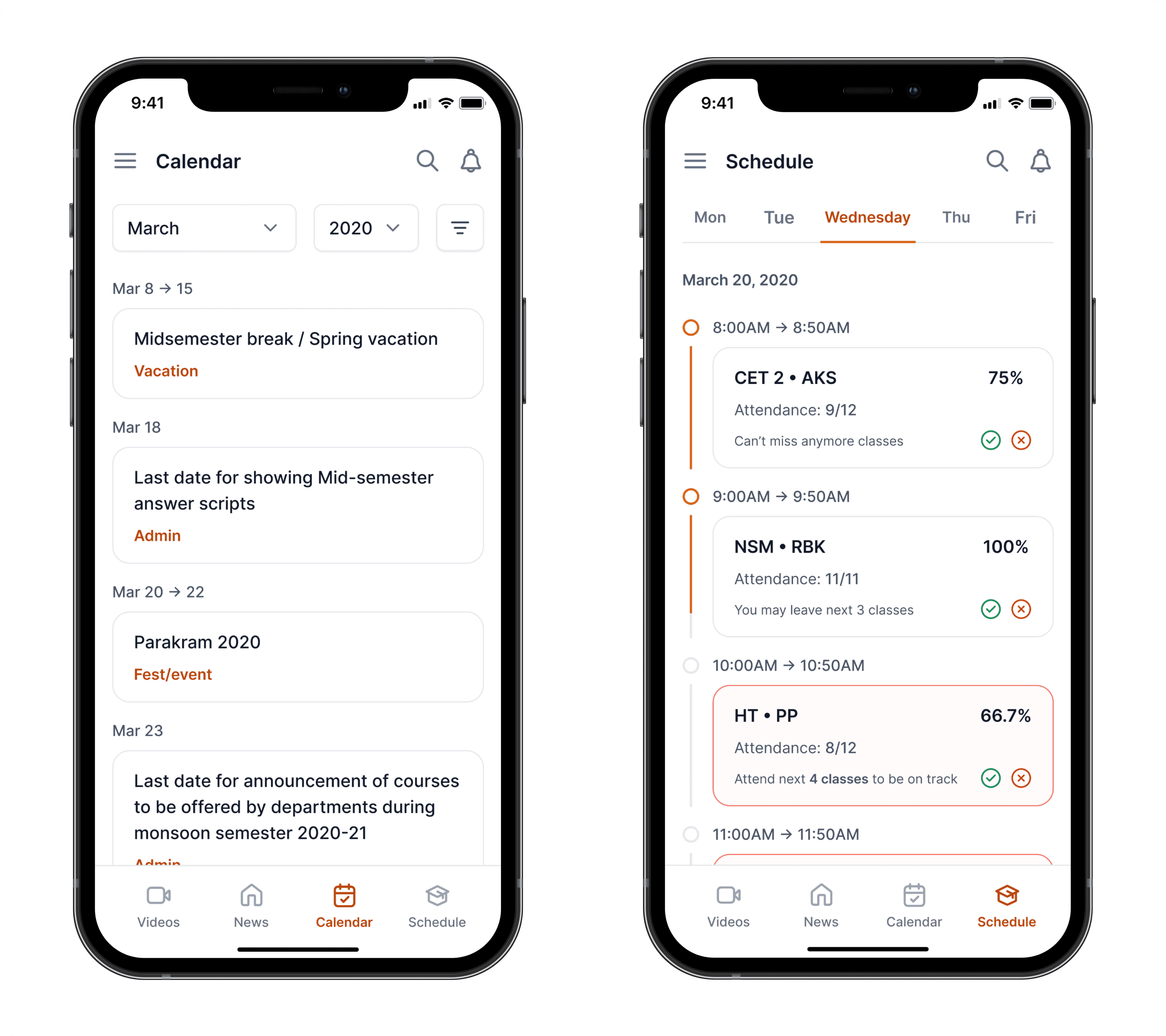
At IIT Dhanbad, attendance isn't just a stat; it’s a rule.
Fall below 75% in any subject, and you lose the right to sit for exams. No exceptions.
The issue? Every course has a different number of lectures. Which means students had to manually track attendance percentages across 5–7 subjects, constantly calculating, adjusting, and stressing.
I rebuilt the Schedule tab with that pressure in mind.
Instead of listing classes passively, I designed a smart tracker that auto-calculated attendance against the course plan, so students could see where they stood, what they could miss, and what needed attention.
I didn’t just show data.
I made it actionable and gave students back control.
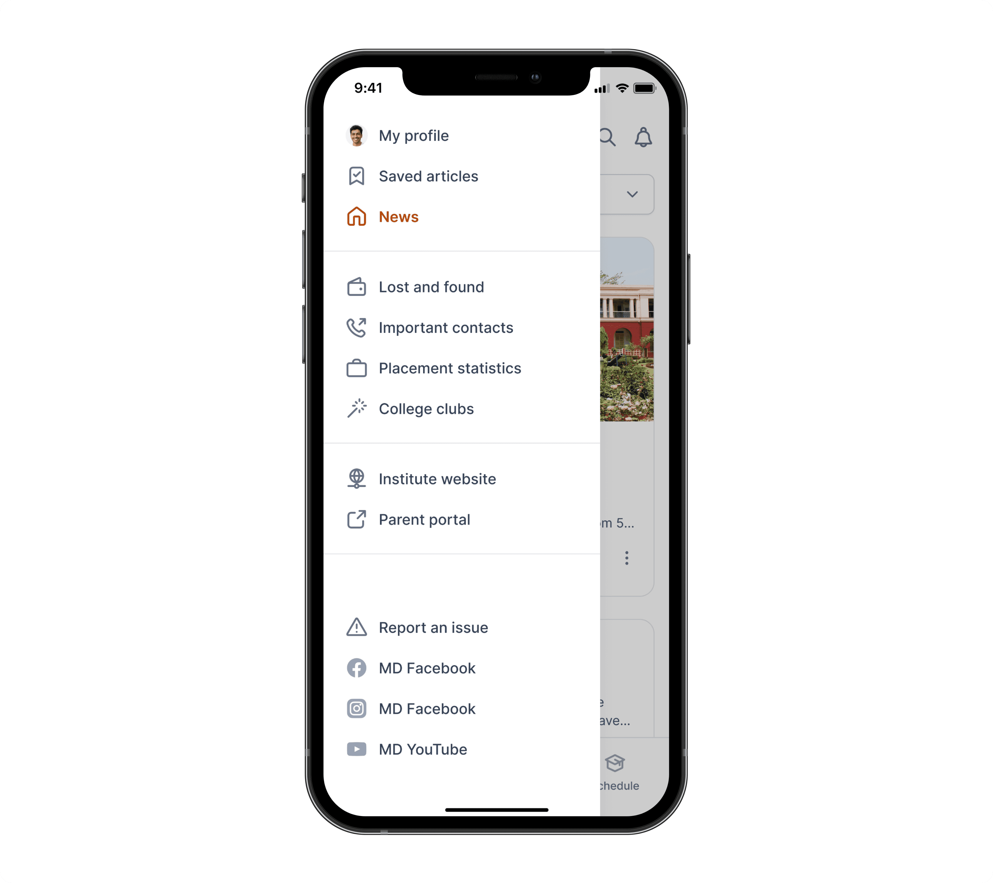
To keep the primary screens focused and frictionless, I introduced a structured sidenav to handle secondary but essential actions.
It gave me a clean way to surface features that didn’t belong in the main flows, but were still critical to the overall experience.
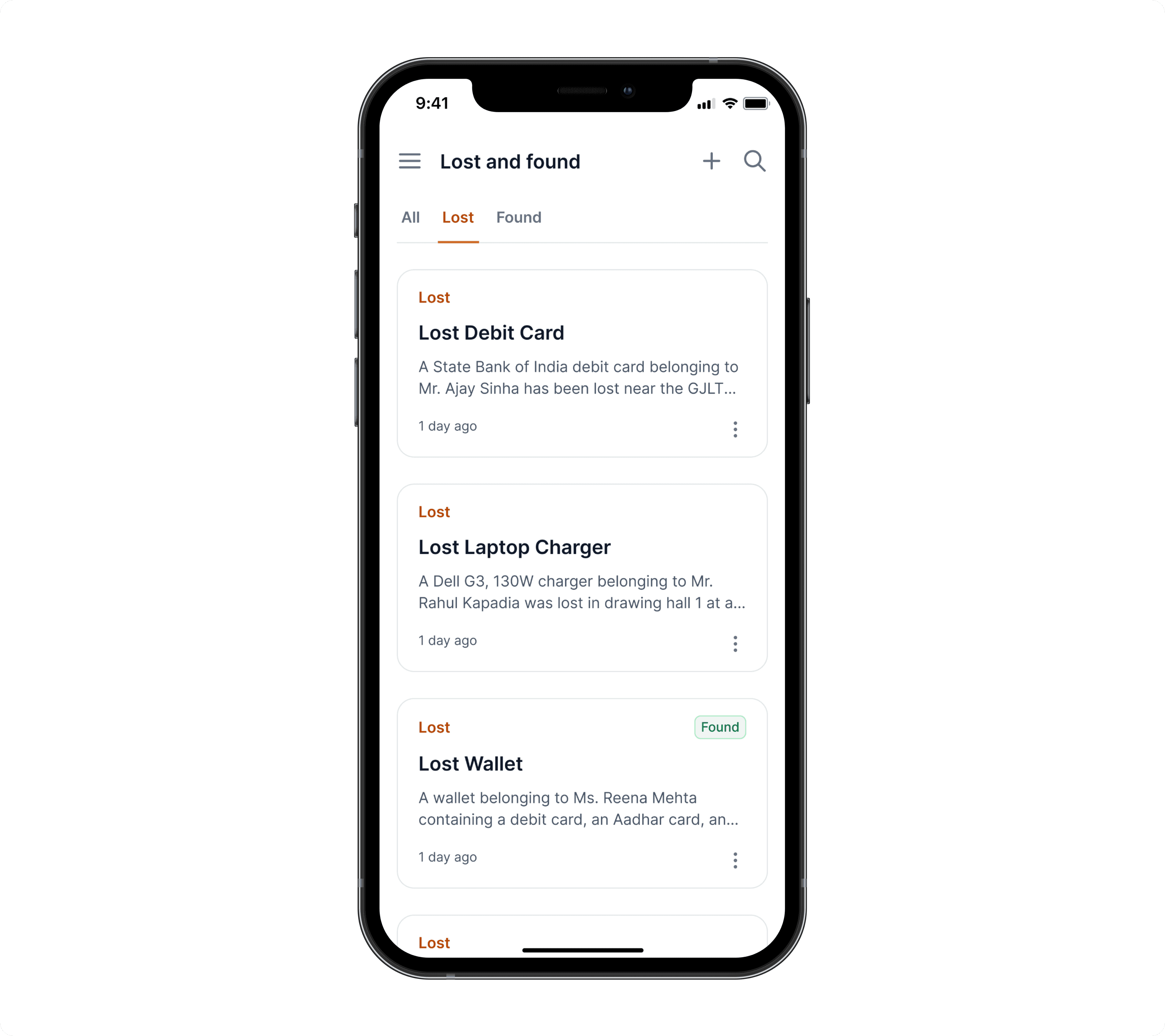
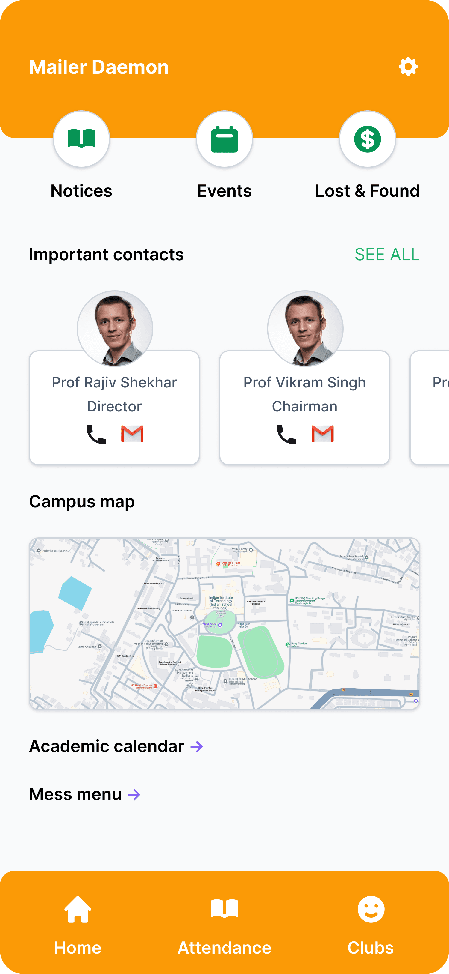
One of the most requested features in our survey was a dedicated Lost & Found section. Students often lost valuables like wallets, ID cards, chargers. But had no structured way to report or recover them beyond random WhatsApp groups or hostel boards.
We designed a simple, two-option workflow:
Lost something? Post a request with details.
Found something? Log it with a description and pickup info.
It sounds basic. But it worked.
We consistently saw 5+ new posts every week, and students began checking the app first before asking around. It became one of the few utility features that solved a real campus problem. Quietly but impactfully.
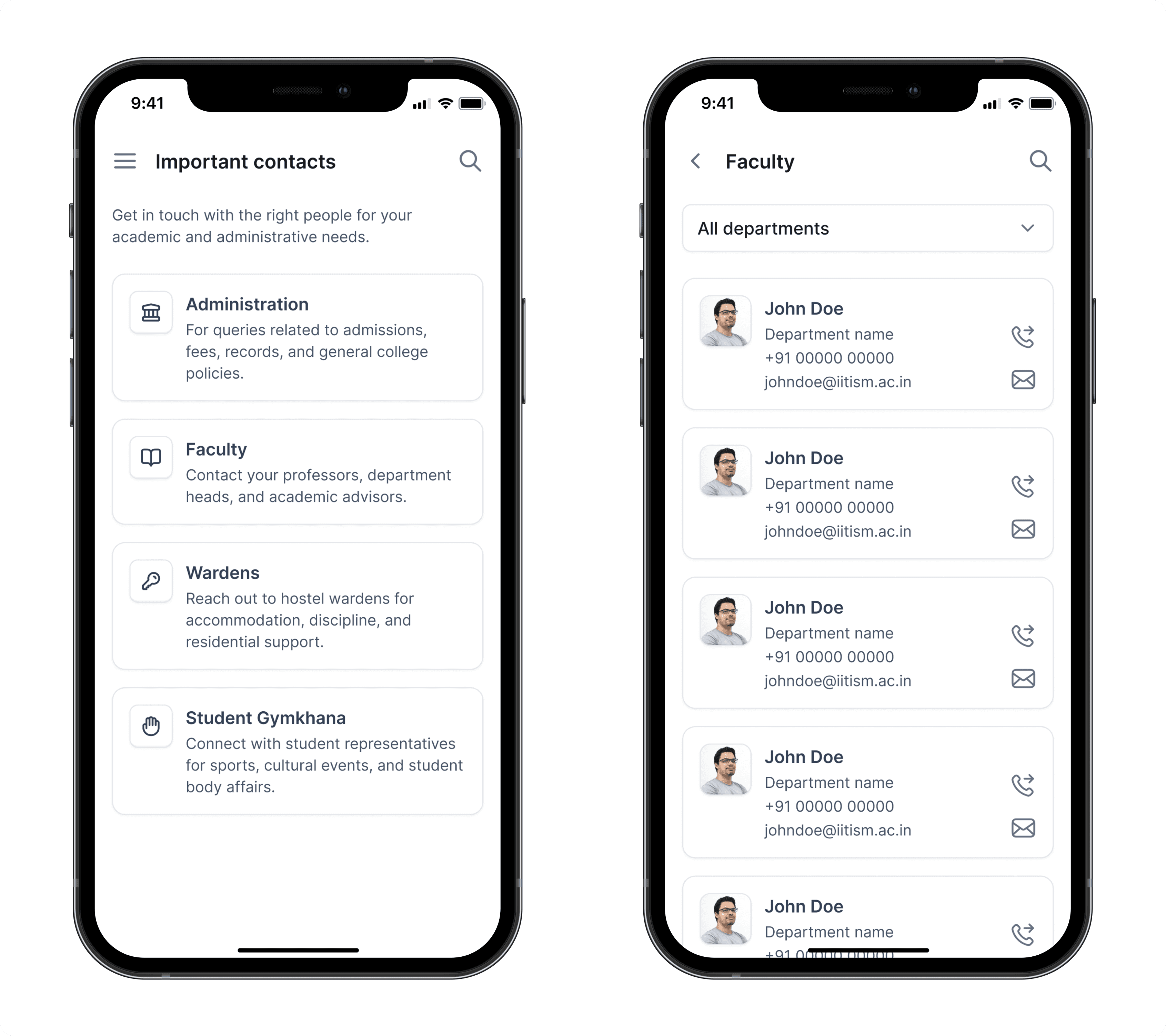
Students interact with a wide range of people across their college life: Admins, professors, wardens, and student reps. But until now, there was no single place to find them.
So I designed the Important Contacts screen with one goal: make it feel instant, not overwhelming.
On landing, students see four clear categories:
Administration
For questions around admissions, fees, records, and institute policies.Faculty
Quick access to professors, department heads, and academic advisors.Wardens
For hostel-related concerns like accommodation, discipline, or support.Student Gymkhana
Connect with student reps for sports, cultural, or council activities.
By default, the layout stays minimal. No clutter. Just the right people, organized by need, so students find who they’re looking for before they get frustrated.
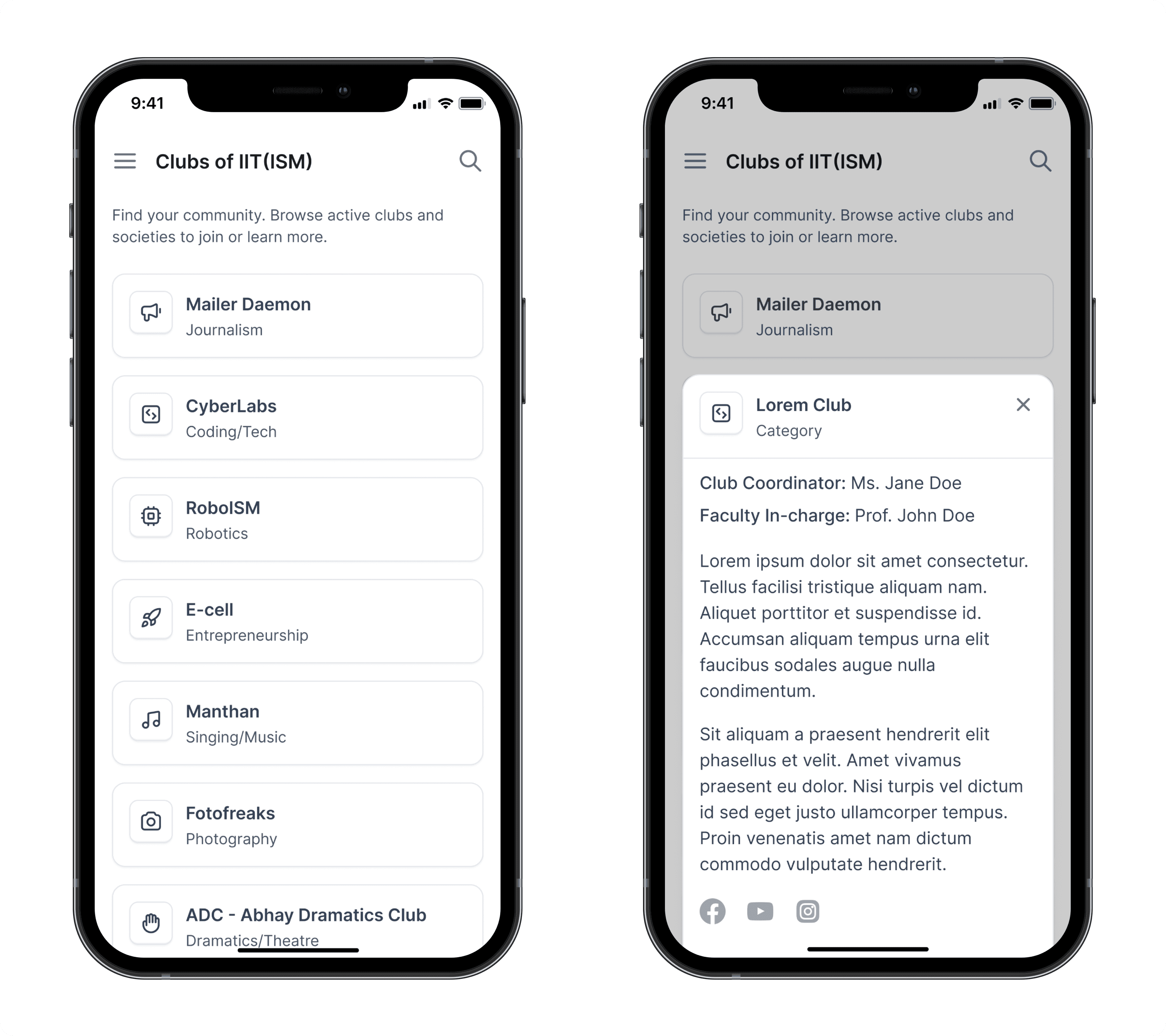
I designed this screen to help students discover and connect with campus clubs more easily.
Each listing included key details: a short description, student coordinator, faculty in-charge, and all active social handles. Instead of static info, the goal was to create a living directory that made clubs feel more accessible and joinable.
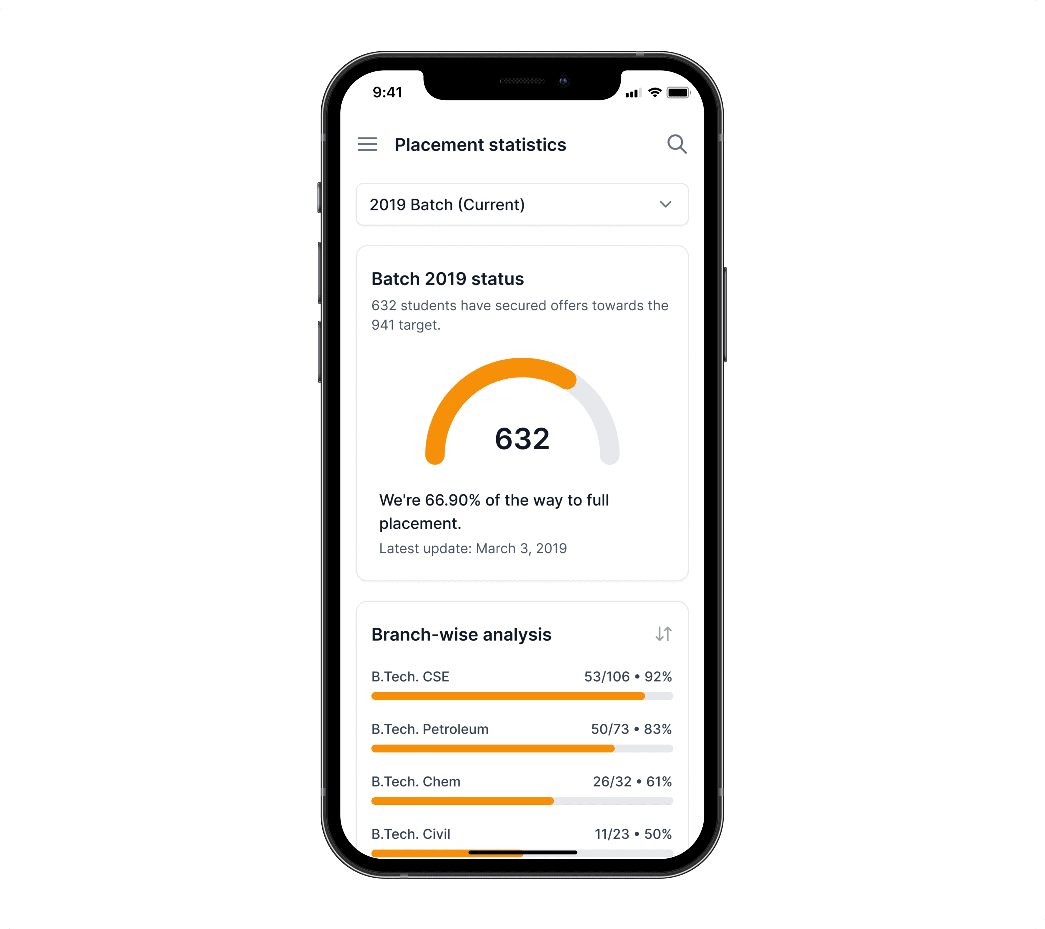
Placement data is one of the most emotionally charged topics on any Indian campus, especially at IITs. When students don’t have access to reliable, up-to-date stats, it fuels anxiety, misinformation, and a sense of being left out.
This wasn’t just a “nice to have.” In our surveys, it was the most requested feature across all student groups.
So I designed a dedicated placement insights screen, drawing inspiration from platforms that visualized data clearly and responsibly. Since Mailer Daemon already reported verified placement updates, we had a unique advantage: the most current data, already being tracked.
The final screen focused on branch-level performance, allowing students to see offer percentages by year and track overall trends. It turned secondhand chatter into something grounded, giving students a way to self-orient without spiraling.
Reflection
A year before this redesign, I had shipped the last version of this app. (The same one you saw earlier with the broken home screen).
It was rough. But it was my first.
Since then, I’d gone deeper. I took on mobile UI/UX freelance work, invested in structured learning, and started thinking less like a screen designer and more like a product owner.
Redesigning this from scratch wasn’t just a UI update. It was a personal checkpoint. It showed me how much more I cared now about structure over style, proof over instinct, and clarity over decoration.
What started as a journalism app became something broader: a utility, a habit, a digital companion for life on campus.
And I got to build it.